In beauty education, color theory often appears as a wheel and a set of rules. In practice, successful Blue Sky Bridges use color as a language between skin, light, and context. Instead of memorizing rigid combinations, we translate undertones and contrast into choices that look intentional in real environments. The aim is not perfect harmony in a vacuum; it is a narrative that flatters the wearer under the light they actually live in.
Begin with undertone mapping. Undertone is not the same as surface tone. Nape, ear, and inner wrist guide the neutral temperature of a person’s coloring. I place the face into a loose category—golden, olive, neutral, cool—but keep room for mixed zones, especially around cheeks and chin where redness or sallowness can mislead. Once mapped, I choose a base that aligns with the neck rather than the face, preserving continuity across the visible field in photos and mirrors.
Next, manage global contrast. High-contrast faces—deep hair, fair skin, bold brows—support stronger color moves, while low-contrast faces sing with tone-on-tone gestures. For lips, matching or slightly elevating the natural lip color frames the face without conflict. For eyes, I consider iris color as a secondary player; what matters more is the surrounding value structure: lash density, brow presence, and the brightness of the sclera. Subtle shifts in value often outperform dramatic complementary shades.
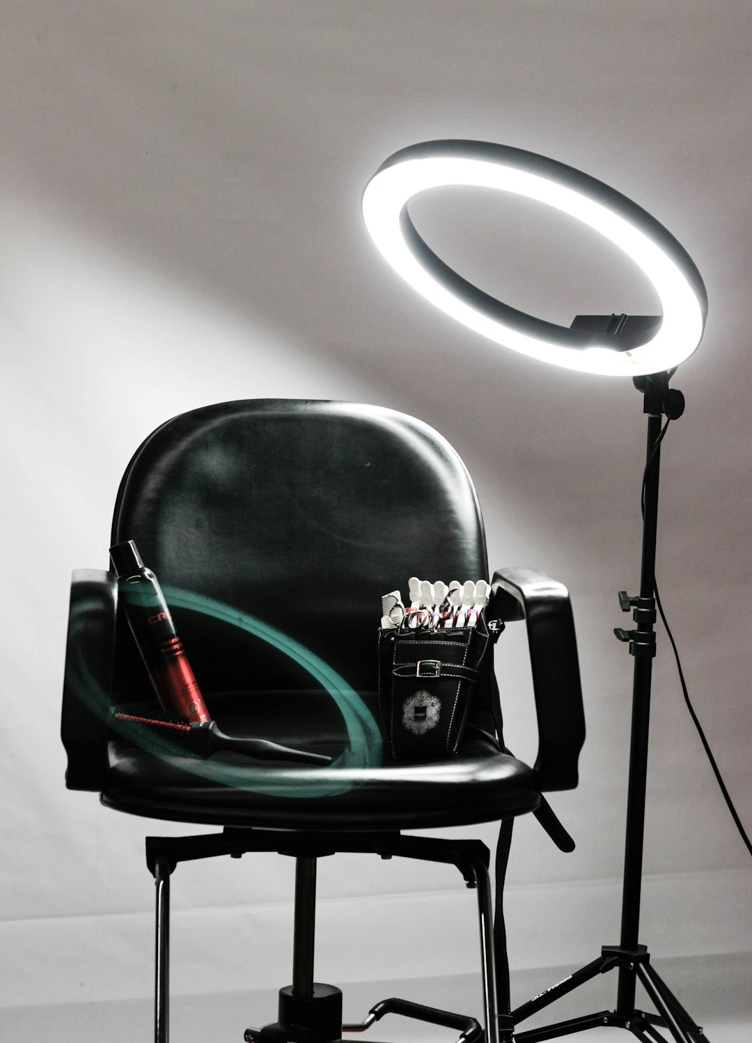
Lighting is the third variable. Daylight cools and flattens warmth; tungsten warms and can swallow nuance; RGB LEDs skew unpredictably. Rather than chasing correction with heavy pigments, I pre-compensate. Under cool daylight, I push a hint of peach into blush to keep life in the face; under warm restaurant light, I reduce brassiness in bronzer and keep highlights satin rather than gloss. For stage or photography, I test in-camera and shift micro-temperatures with translucent veils rather than repainting the face.
When combining colors, I follow a three-note structure: base, lift, and accent. The base grounds the look in the person’s undertone. The lift introduces dimension—usually via blush or a softly reflective highlight. The accent adds direction: a lip, a liner, or a shadow that tells the story. If all three notes shout, the composition loses clarity. If two notes whisper and one sings, the eye knows where to go.
Corrective color is a scalpel, not a sledgehammer. Green cancels red in theory, but in practice a sheer neutralizing veil works better than opaque mint layers that turn grey under flash. Peach and apricot are kinder correctors on varied skin depths. I correct as little as possible, then rely on a harmonizing blush or lip to bring the face back into balance.
Finally, remember that color communicates identity. Cultural aesthetics, personal history, and wardrobe shift what “works.” Listen to your subject. Ask for the colors they love and the ones they avoid. Build from their language, not yours. The most elegant palette is the one that feels like home on their skin—and stays honest in changing light.

